Palette Play

A palette as cozy as it is enduring and strong. Create spaces of quiet assurance.

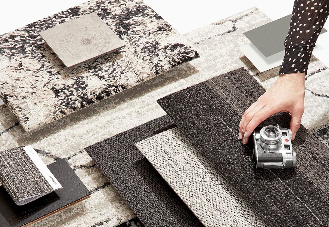
Cocoons can also be refreshing and invigorating. A neutral palette that conveys a sense of life.

A sanctuary can embolden the spirit as it refreshes the soul. Make a statement that is at once graphic and confident.

Soothe, nurture, comfort with a palette that imbues a sense of balance and harmony.

Can a palette help you feel calm, connected and confident? This one, based on the classic hue, certainly can.

Back to nature? How about we never left. Earth’s favorite palette for its power to revive, restore and reinvigorate.

Wake up spaces with a palette that underscores our quest for balance and tranquility as we hit the refresh button.

Here comes the sun. A palette that radiates feelings of happiness, hope and optimism.

Fresh and vibrant while evoking a sense of nostalgia and familiarity. This palette speaks to a relaxed cheerfulness.

A sense of a firm foundation under our feet. Solid, dependable, certain. As tough and resilient as we’ve all become.

A sense of rebirth, renewed energy. A refreshed zest for life. Dare we say celebration?